Idea and Inspiration
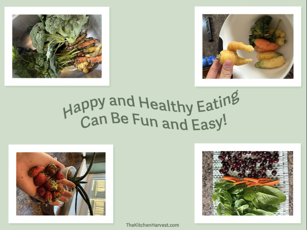
The inspiration for this visual comes from a personal interest in healthier living. By simply planting seeds, and a little bit of patience, one can easily bring healthy foods to the dinner table for the whole family to enjoy! I want to show the audience that we can nourish our growing bodies with food that does not need to be hard to find, nor expensive to afford. With just a few simple ingredients, a very delicious meal can be prepared. Helping people understand what the different food groups mean can help educate other people (parents, teachers, etc) that good, nutritious food does not need to be grand or extravagant, but simple and equally healthy.
Design Process
For this project, I wanted to design something that is easy to understand while still having an element of aesthetics. Personally, my favorite part of this visual are the borders around each image. I think it helps accentuate some emotion one may feel from seeing the images. For example, to me, the pictures of food in this visual make me feel happy and good about eating. The vignette effect also gives a soft tough to the overall project, as well as piecing it all together nicely. The rough draft had more pictures to fill up the space, but after seeing some of the feedback from my classmates, I decided to take some of the pictures out to make the existing photos of food bigger and clearer to see. I also added more text to fill up some of the empty space. Using different colors for each fruit/vegetable name was intention as it makes the words pop out more and gives some imagery to the deliciousness that are fruits and vegetables. Overall, I think the consistency of the design makes it clear to see, and delivers the message in a straightforward manner. For this project, I used concepts from tutorial one and two to incorporate into my project. I like the simplicity of those concepts while still making the visual effective.
Technical Detail
The project itself was not very hard to construct. Most of the efforts needed to create this visual requires a relatively repetitive sequence containing only a few easy steps. I began with changing the color of the background to a light and neutral color. I then incorporated the text in the middle, where I want most of the information to be, front and center. Supporting the text are images that I have edited to contain a white border. And lastly, adding the vignette effect in the end. Using the concepts from tutorial one and two helped amplify the quality of the poster, in that it makes it more visually appealing. Actually executing these concepts are fairly simple to understand, and only takes a few tries of practice to get it right. For future references, I probably would try to learn more about pixels and how it affects the quality of a specific size or project.
Sources and Materials
Photoshop was used to create this visual. The images used were taken directly from my own personal cell phone, and have been used with permission from me by me.